Pages

Saturday, April 26, 2014

OPI Love Athletes in Cleats

OPI Love Athletes in Cleats is a gorgeous midtone red shimmer from the recently released Major League Baseball collection.  The shimmer isn't glittery, but more like a muted glass fleck type.  Application was great - nice formula, easy to control, and built nicely in opacity.  The shimmer is somewhat silvery, which makes it interesting to look at in indirect light as well as in the sun where the shimmer truly shines.  It is very close in base color to Short-Stop! from this same collection, but I'd say SS is a tad cooler.  This is definitely a home run in my book!  Enjoy -     >^..^<


FP Motley over OPI Incognito in Sausalito

FP Motley over OPI Incognito in Sausalito is a favorite combination of mine.  IiS is a dark navy creme, and Motley is a gorgeous blue and green flakie topcoat.  Application on both was good - IiS went on smoothly and was easy to control, and was almost a 1 coater.  I used 1 coat of Motley here, and it gives IiS a bit of life and depth.  Both of these colors are worth owning, and IiS is easy to find - Motley not so much, but it does pop up in blog sales and on eBay from time to time.  Enjoy -     >^..^<


OPI Live. Love. Carnaval

OPI Live. Love. Carnaval is a beautiful coral creme from the Spring / Summer 2014 Brazil collection.  Like many pastel cremes, application left some to be desired - it was a bit thick and streaky, and I could still see uneven areas after it dried.  The color itself is very nice, though - very cheery and happy, which is much needed after the long, cold winter we've had.  It isn't a very unique shade, and I'm sure it's dupeable, so it's not a must-have color for me.  Enjoy -     >^..^<


Essie Lady Like

Essie Lady Like has 2 versions - this is the black-label original Ulta exclusive from Fall 2007, not the more recent Fall 2011 release of a dusty pale pink.  I love this polish - it is what I'd call a raspberry mauve, not red at all, but a rather unique shade that isn't too bright, but is still vibrant.  It has a jelly formula with beautiful shimmer that you just don't see anymore with b3f colors (this is black label = not b3f).  Application was a little tricky, as it wants to be a bit streaky and has some cuticle drag, but I used 3 coats here and was happy with the evenness and opacity.  It is gorgeous in all lighting, but the shimmer really stands out in the sun!  Enjoy -     >^..^<


OPI Short-Stop!

OPI Short-Stop! is from the recently released Major League Baseball collection.  It is a beautiful cool toned bright red creme, and it is so pretty!  It has a slightly crelly formula, and application was easy.  The formula is smooth and creamy and went on without a streak.  It's not a terribly unique shade, but I love red cremes, so I'll forgive it for being dupe-able.  Enjoy -     >^..^<


OPI 7th Inning Strrretch

OPI 7th Inning Strrretch is from the newly released Major League Baseball collection.  It is a slate blue frost, and it is lovely!  Application was ok - the formula was creamy, and was almost a 1 coater, but did show some brushstrokes.  It is a little more grey in real life than in pictures, both my pics and those by others - every picture I've seen of it makes it look like a brighter blue than it actually is.  So much so I questioned what I was seeing when I found the collection in real life.  It is so much prettier in person than in pics.  And the fact that the sun didn't want to come out much while I was wearing it didn't help in the picture department.  But - I love colors like this, and I am very happy with it!


Friday, April 25, 2014

OPI (?) Pulled Out a Plum

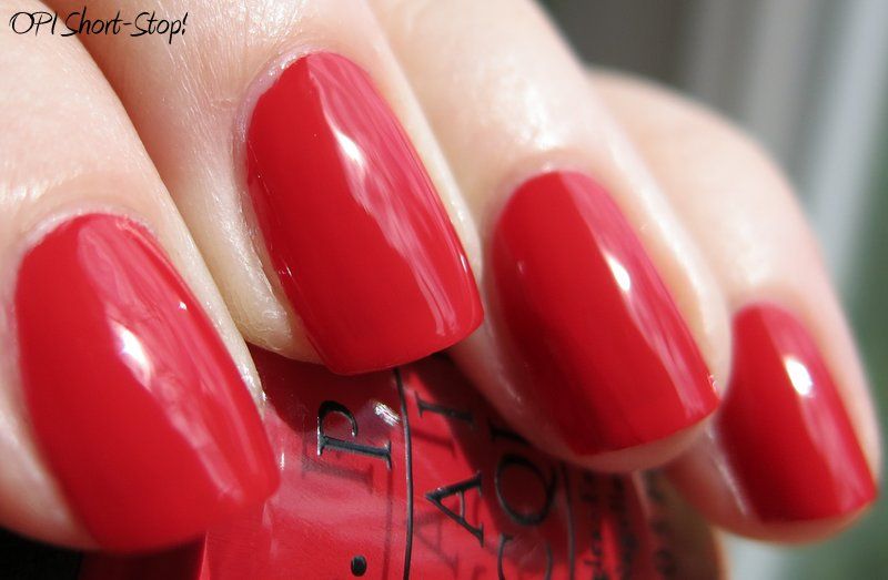
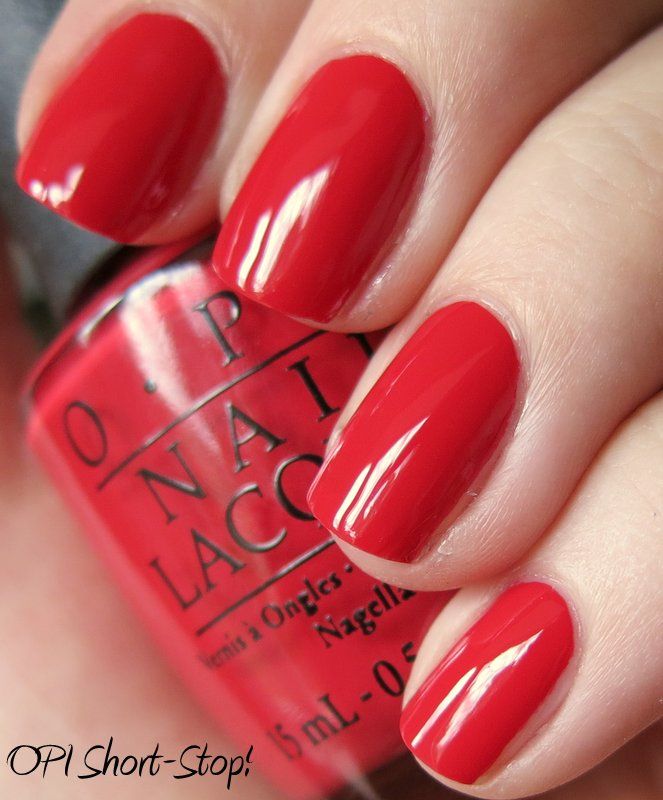
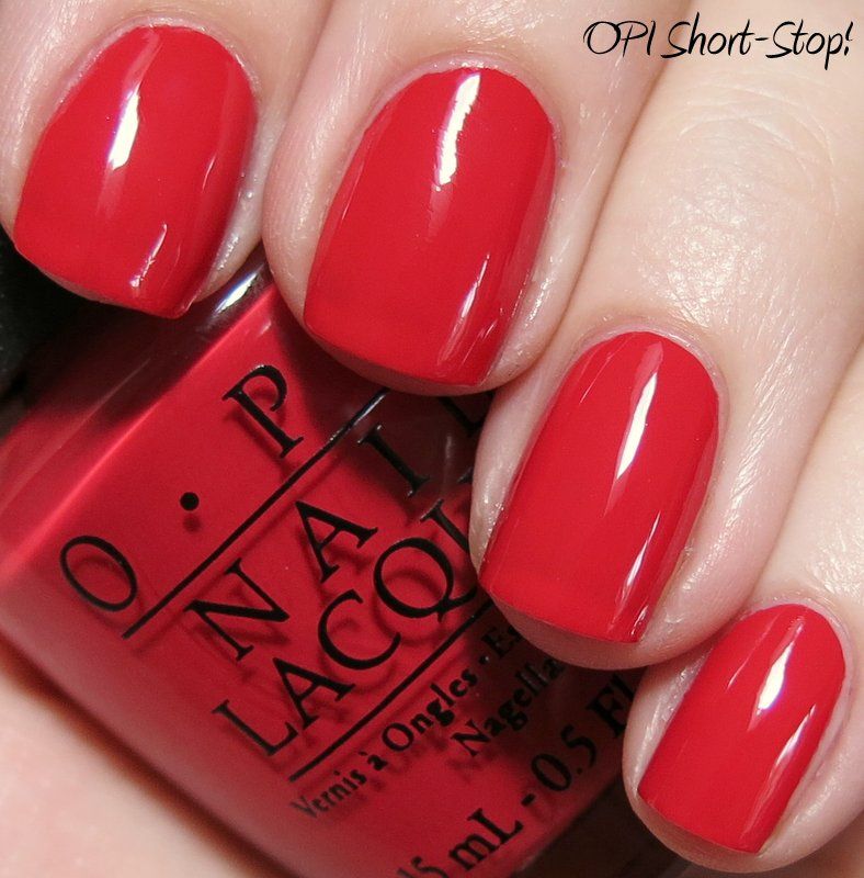
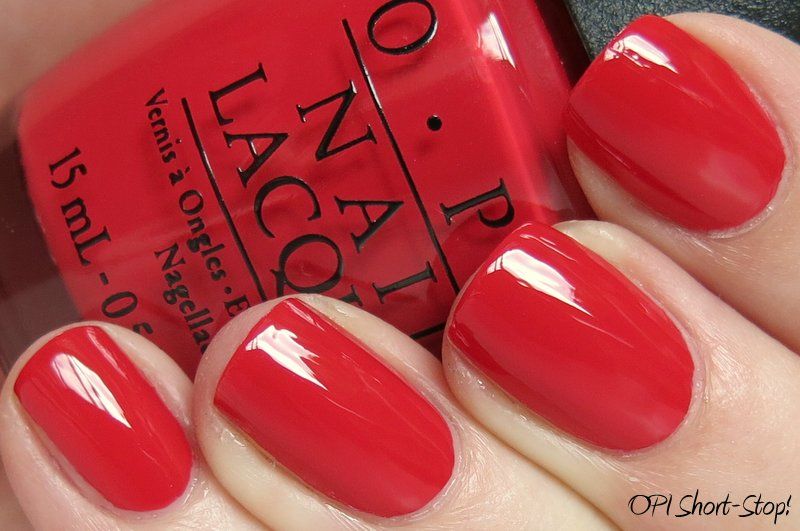
I'm back!  Sorry for the hiatus - we took a wonderful trip to Italy, and had a fantastic time.  It's been hard getting back into the swing of things since we returned, but I have several manis to share!

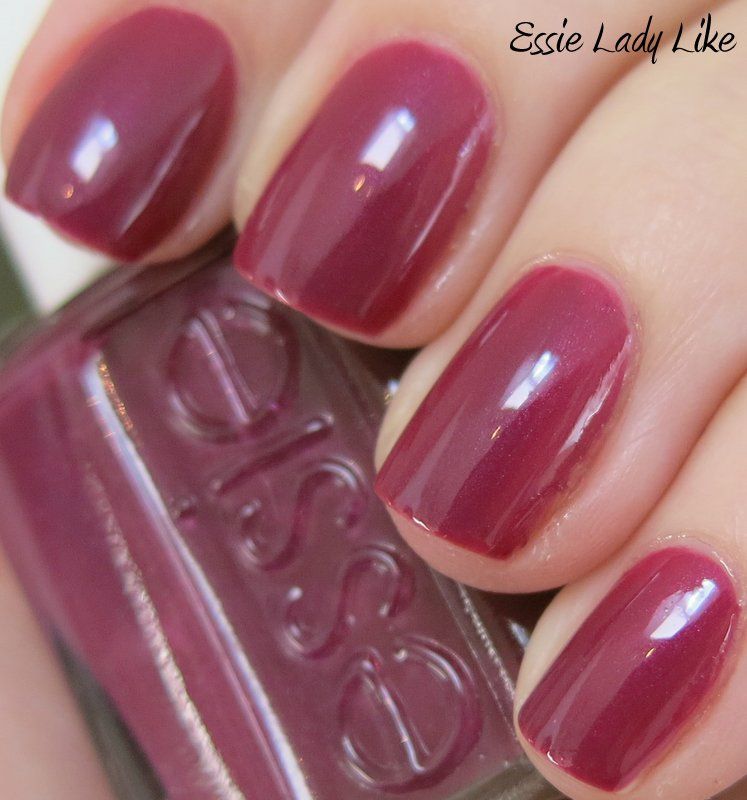
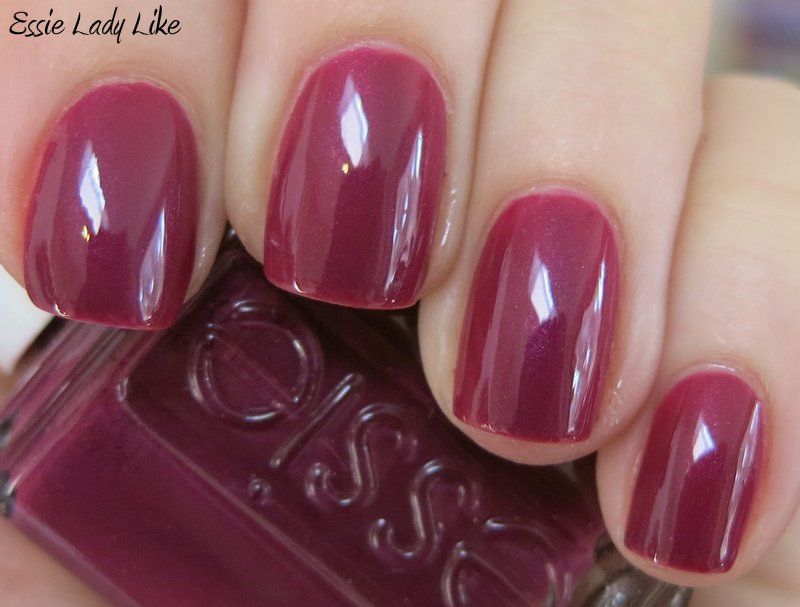
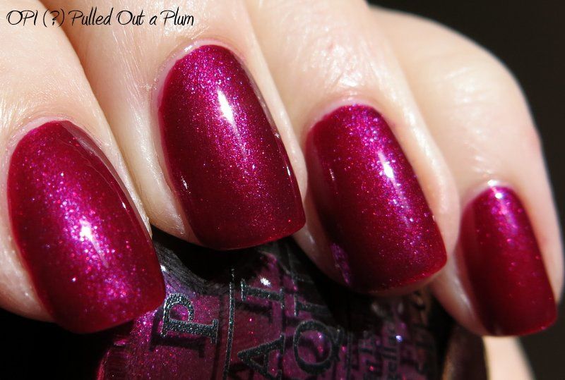
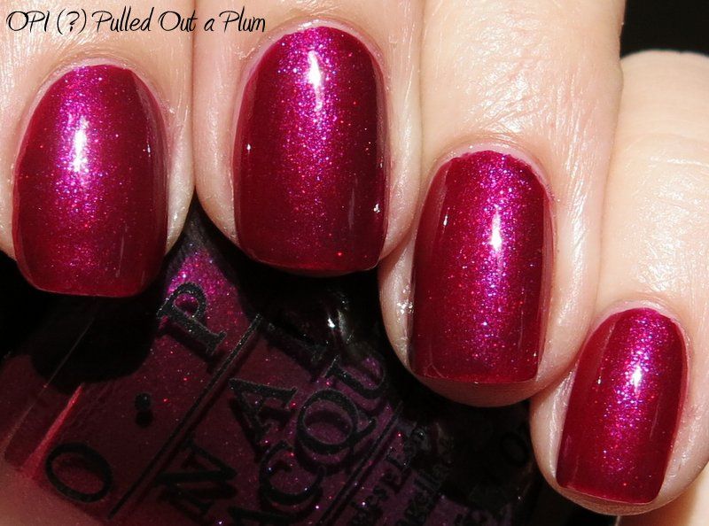
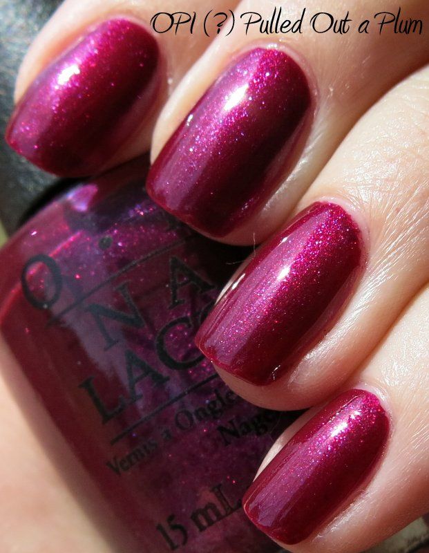
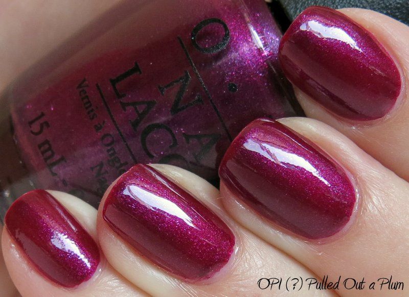
This one is - maybe? - OPI (?) Pulled Out a Plum.  I found it at TJ Maxx, and I've never heard of it before.  I googled it, and the only posts are sales in the UK and New Zealand.  Odd.  It is number NL 920, which is different than most OPI's that have 2 letters, a space, then one letter and 2 numbers.  So that raises my suspicions.  The printing on the label looks fine in terms of letter formation and placement, but the ink itself looks different - this one has a more gritty textured look to the paint than legitimate OPI's that are glossy and smooth.  Another red flag.  Hmm.

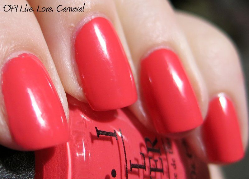
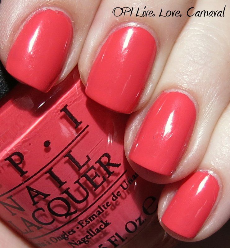
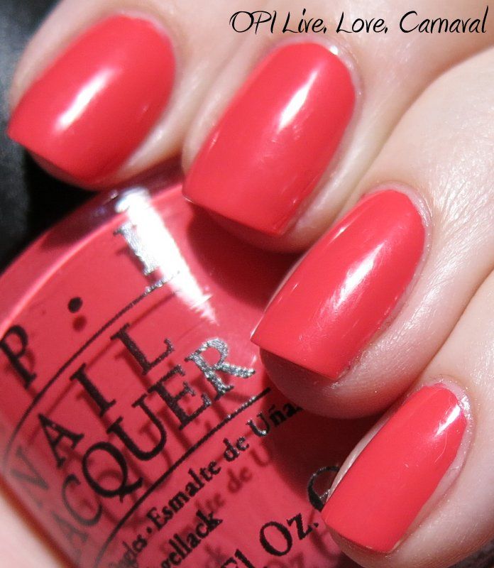
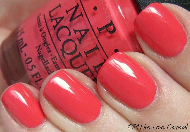
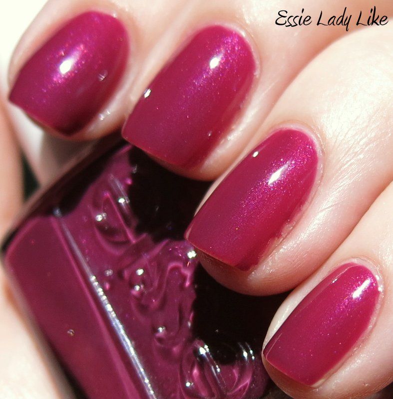
All that aside, it is a very pretty polish.  It is a midtone plum with sparkles, and it looks lovely, especially in the sun.  Application was ok - minimal streaking, and built nicely in opacity.  It has beautiful pink-toned microshimmer / microglitter that really sparkles in direct light, and gives an interesting mottled appearance in indirect light.  I like it, whether it's legit or not!


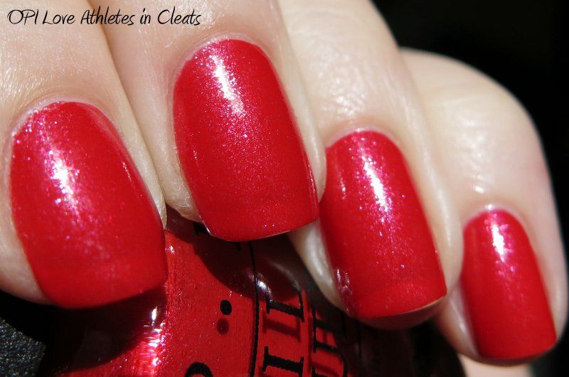
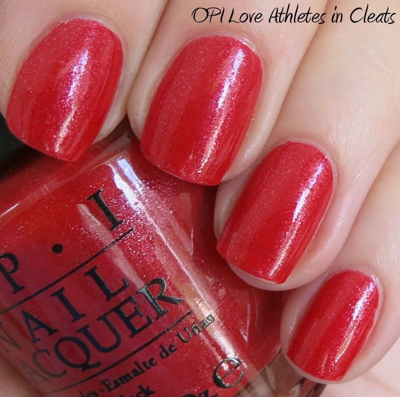
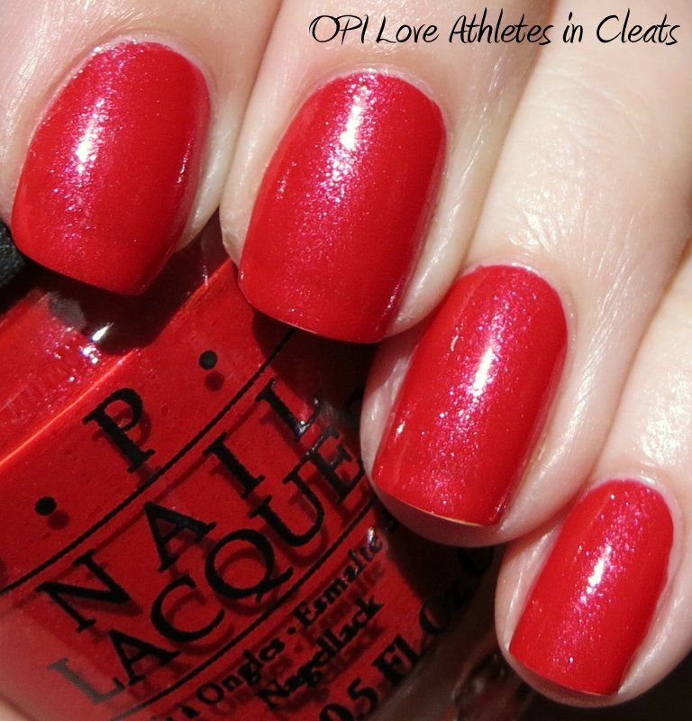
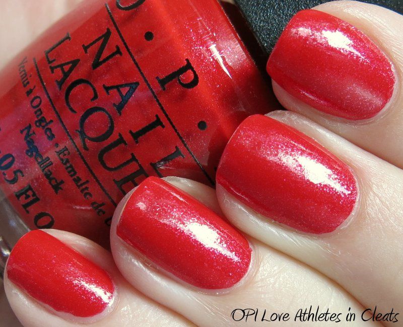
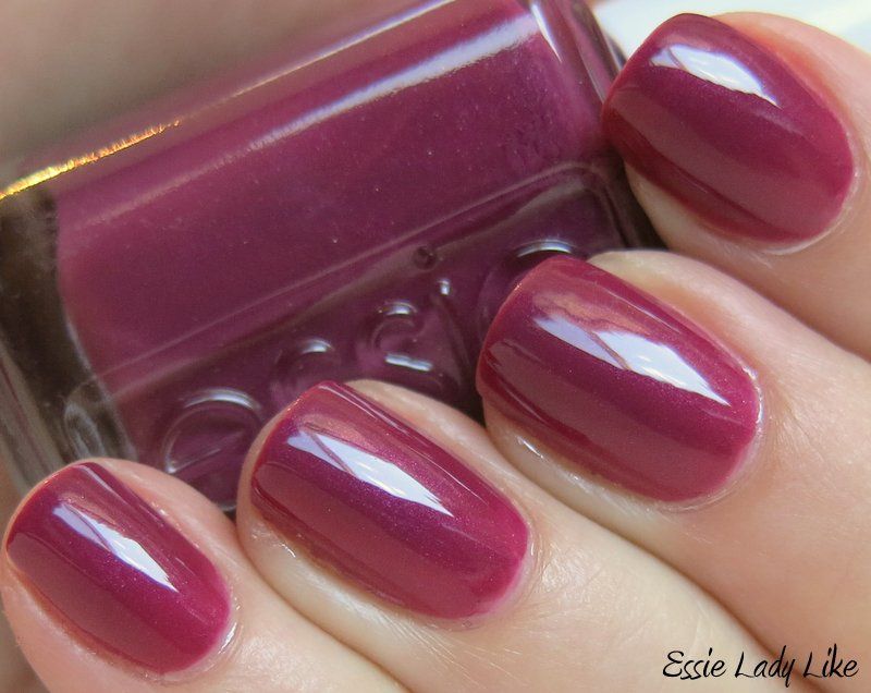
This is a shot of the backs of the bottles of Pulled Out a Plum and a legitimate OPI, Athletes in Cleats from the MLB collection.  The writing looks convincing...
...but if you look at the paint itself, the Plum is lumpy and the real OPI is smooth, and it is smooth in all the other OPI bottles I've checked as well.